

How Art and Color Create the Feeling of Home
/Can Color Change The Way You Enjoy Your Space?
The Feelings Hidden In Every Color
Color influences how you experience your environment. It affects your mood, your energy, and even the way you connect with others. The design of a room can change completely through color, turning chaos into calm or stillness into inspiration. Design becomes meaningful when you recognize this connection between color and emotion. The spaces you create are not only about how they look but reflections of how you want to feel every day. By being intentional with color, art, and design, you create spaces that feel good and reflect who you are.
Each color carries its own story, a feeling that shapes the way you move through a space. The rooms you’ll explore below are inspired by the interior color trends for next year, showing how modern palettes can influence emotion and transform the atmosphere around you.
Let The Greens That Live On Your Walls Remind You of Your Connection to Nature
The greens feel alive, full of movement and quiet strength. They blend with soft browns and touches of gold that remind you of sunlight resting on leaves at the end of a long day. Together, these colors lift your mood, they make you breathe slower and be more present. It feels like you are bringing nature into your home, delivering a sense of ease, comfort, and relaxation.
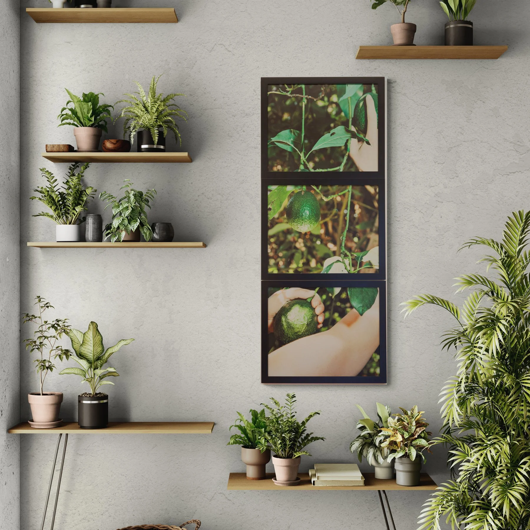
Temptations of the Kampong: Avocados I (3 panel triptych)featured in this modern botanical interior. (Click the image to shop this print)
When Blue Finds A Place In Your Home
Peace Quietly Follows
Blue is the color of calmness like a visual breath of fresh air. It has even been proven to slow down heart rate. It welcomes your guests with tranquility when they walk into your home. Choose light and pale blues to relax and heal your mind. The blues in this interior design don’t just calm the space, they calm you. They make everything feel lighter, like there’s more room to breathe. The warm colors of yellow and pink keeps the space from feeling cold.
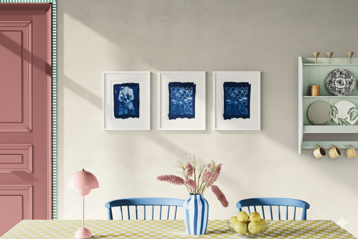
Sustain limited edition cyanotype prints (Click the image to shop thEsE printS)
When Golden And Earthy Tones Wrap
Your Space In Warmth, You Remember
What It Feels Like To Truly Be Home.
Golden and earthy tones make the room feel warm and lived in. There’s something comforting in the way these colors fill the space, creating a sense of steadiness. They make the room feel grounded and easy to be in. It’s the kind of warmth that reminds you to slow down, to enjoy the moment, and to feel at home. The harmonious colors in this bedroom creates a space of comfort that invites relaxation.

Halictid Bees Pollinate Vanessa Grapes in the Dyer's Garden (Click the image to shop this print)
Did you see an artwork that you love?
Curious to see how your favorite piece could look in your home?
I can help you create your personalized mockup.
Contact Ivana by sending a message here.
Color has a way of changing how we feel without us even noticing. Which tones make you feel most at home? Share your thoughts below!